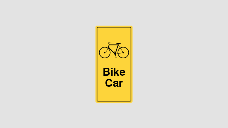
Caltrain Bike Tag Redesign
Back in 2014 after Nitrous raised our Series A Financing, we found that we couldn’t hire fast enough in the South Bay. In my experience, unless you attended Stanford or have worked in the South Bay for a number of years, it’s difficult to meet people with the velocity required to hire fast enough to satiate venture-backed growth (that’s a loaded statement that’s worthy of its own blog post).
In any case, we decided a few months after raising our Series A that we’d expand our luck area by moving our offices to San Francisco. We picked a scrappy building at the corner of 2nd and Brannan, right next door to the team at Buffer (who have subsequently ditched offices entirely).
Since I had just signed a lease in Mountain View, it was decided that I would be making the daily 1-1.5hr commute. And since driving was out of the question, I decided I’d bike to the Caltrain and camp out in the cozy bike cars.
Bikes on bikes on bikes
My first day biking, I was confronted with a sea of bikes stacked on top of one another. I unwittingly parked my bike on the outside of one of the columns of bikes and found a seat in the cabin above.
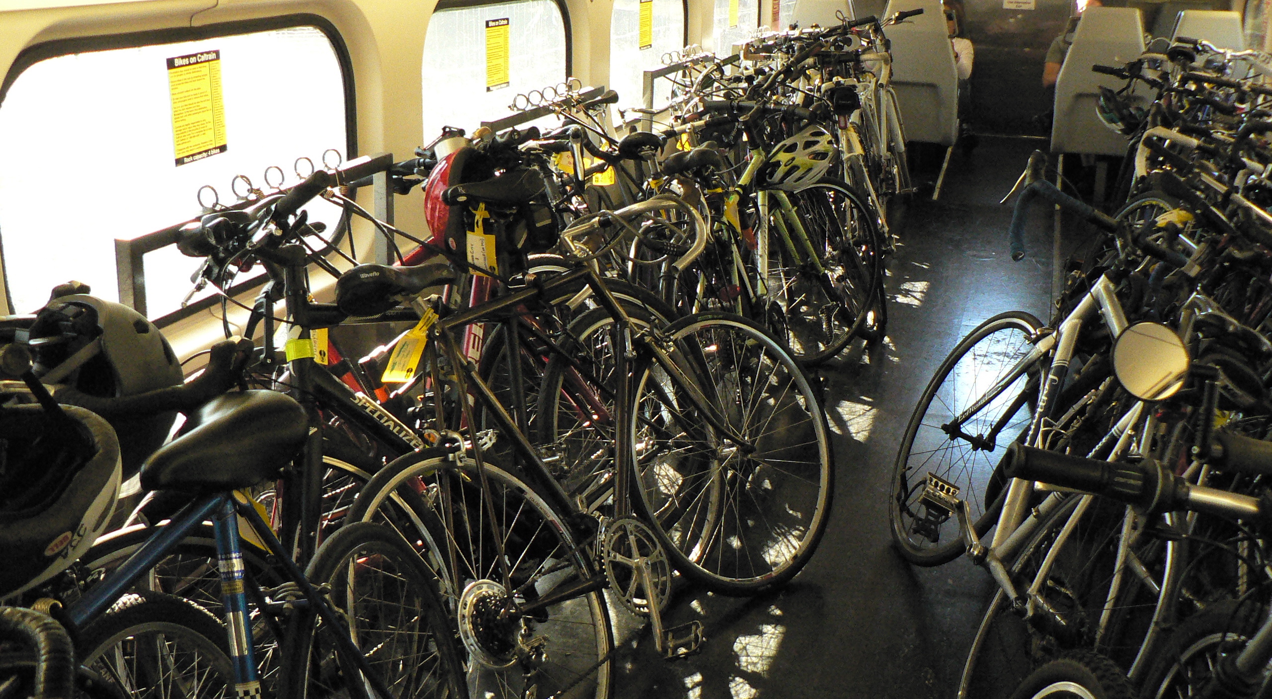
At the Palo Alto stop, a number of bicycle commuters boarded and began inspecting the bike seats. At first I didn’t notice, until I heard one disgruntled bicyclist stop at my silver single-speed and shout “Who’s bike is this!?”.
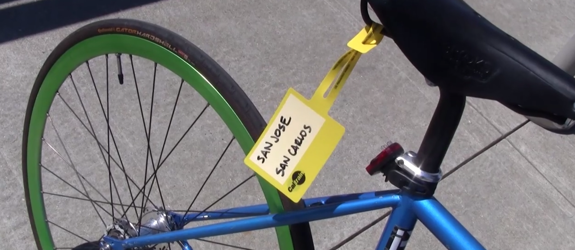
I answered that it was mine, and he asked where I was heading. I told him I was going to San Francisco, and he introduced me to these little yellow informational seat tags that display the bikes origin and destination. These are meant to assist bikers in efficiently stacking their bikes so there isn’t a complex forest of wheels and handlebars to disentangle during the short period in which a passenger must disembark.
I thanked the biker for the information and asked the conductor for a bike tag. He grumbled something unintelligible and left, to return a minute later with one of the yellow tags.
Flipping through stacks
These yellow biketags became daily reading for me during my commutes. Each day I would shuffle myself into the crowded bikecar and wait impatiently as each biker inspected the tags before finding a home for her bike. Often, the handwriting wasn’t legible, the tags were upside-down or weren’t facing in a direction that made them immediately readable.
So I began thinking of other possible design solutions that could help the bike sorting problem. I scribbled down the following requirements of well-designed signage:
1. It should be identifiable via a sharp and unique color
This would make it easy to identify the location of the tag and draw the visual attention to the tag. The current tags do this reasonably well since they’re yellow.
2. It should display the bike's destination succinctly.
The current bike tags handle this by just having you write out the city destination in freehand. The issue is that some destinations are quite long which thus require smaller text, negatively affecting legibility.
Ideally, origin and destination are clearly designated and are paired with their ascending stop number (#1, #2, #3, etc…) which would also help those who don’t know that San Carlos comes after Redwood City on inbound trains, or that Hillsdale is before Belmont on outbound trains.
3. It should be easy to apply.
The first solution that came to mind was to use a sticker, but since the frame is cylindrical and differs in diameter depending on the bike, finding a consistent place to put similarly sized stickers would prove to be a challenge.
4. It should be hard to remove.
This is simply to avoid theft (though nobody should want to steal a biketag, San Francisco isn’t known for its lack of theft). This also might get annoying if you are selling your bike or otherwise want to remove the sticker.
5. It should be less than $10.
The current bike tags from Caltrain are free. I don’t know how much they cost Caltrain to manufacture, though I’d estimate they cost $0.10 - $0.30 a piece. An independently produced tag would almost certainly be more expensive.
6. It should be waterproof.
Again, here the current tags suffice. Since the writing itself is up to the bike owner, it depends on if they use waterproof ink to markup the tag. Given the relative lack of rain in the Bay Area, this isn’t too much of a concern.
7. It should be viewable on both sides of the bike.
Since a bike could be stacked with its right side facing outwards or vice versa, the signage needs to be viewable in both directions. This is handled reasonably well with the standard bike tag, since it dangles and is maneuverable. However, it’s often inconveniently angled when you’re attempting to read it a quick glance, which requires some finagling. This can be somewhat frustrating when repeating the task.
Solutions
Ok, so finally to the fun part: Designing the signage.The first solution I thought of was a sticker, and I set out to design a simple sticker.

This looked OK, but failed a bunch of the requirements. For example, it didn’t tell me where San Francisco or Mountain View were on the Caltrain line.
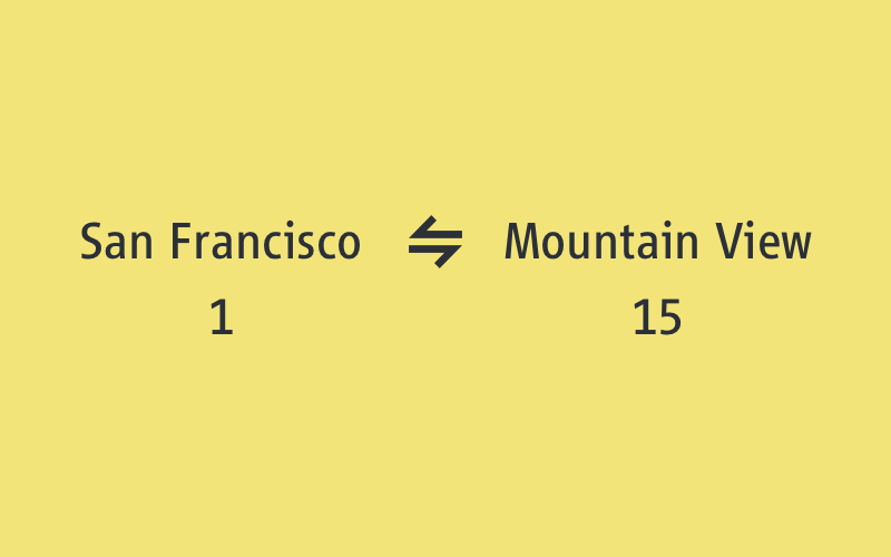
So I decided to add station numbers to the right and left of the station names. This way even new commuters who hadn’t memorized the station order would know whether they were placing their bikes before or after the wrong stop.

But as I designed more stickers, I realized that stickers had the major issue of consistency of placement. Not all frames are alike - different sizes, heights and shapes would make sticker size an issue and therefore make legibility a major issue as well. So it seemed that stickers were out.
Occam's Razor
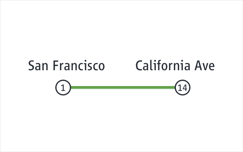
After considering the design constraints, I came to the somewhat depressing conclusion that, all things considered, the current seat-tag solution is reasonably efficient given the design constraints posited above. They are yellow, reasonably legible, waterproof, somewhat challenging to remove, easy to put on the bike, and extremely inexpensive. The only significant improvement that I could think of would be to add the station number to the origin/destination to better distinguish between some of the lesser-known destinations which would decrease incorrect stacking.
Here’s a example on a white background from San Francisco (station 1) to California Avenue Station in Mountain View (station 14):
Of course, white tags can get weathered and quite dirty and aren’t as visually commanding as a yellow tag, so I designed a yellow counterpart:
I think this would work reasonably well. The only other improvements I could think of were to give a sense of the overall distance of the Caltrain line and where each stop is located within the entire line. I made some attempts to integrate the overall caltrain line but couldn’t do so without making things much more cluttered and noisy. So what I ended up with after a few hours of experimenting was pretty close to the current solution…